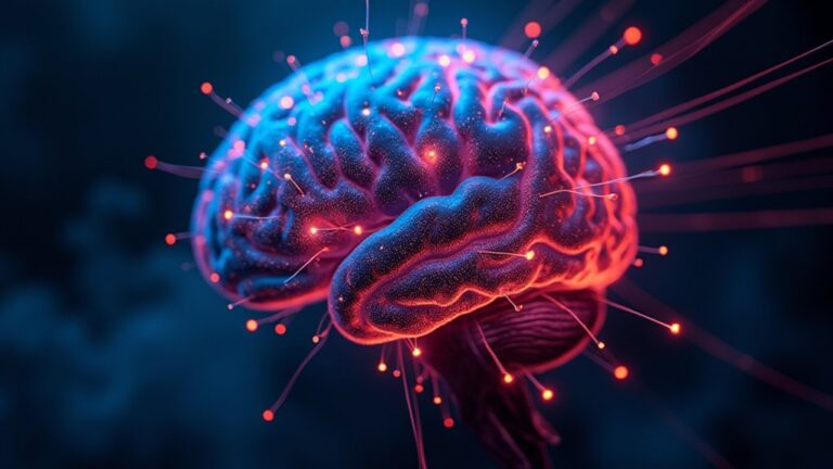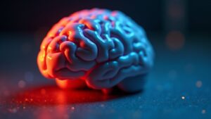
Colors influence the brain in surprising ways, shaping emotions, focus, and even physical reactions. Warm shades like red or orange can spike energy and alertness, while cool blues and greens tend to soothe stress. These responses trace back to primal instincts-think fiery sunsets signaling danger or lush greenery hinting at safety. But color’s power isn’t just ancient history; it plays out in homes, offices, and ads every day, quietly steering moods and decisions. Curious how something so simple wields such deep control?
The Science Behind Color Perception
Have you ever marveled why certain colors make you feel alert while others seem to pacify your nerves? Research on Color Psychology shows different shades trigger distinct emotional effects due to how the brain processes them.
The visual cortex, a key area for interpreting color, links hues to instinctive responses shaped by evolution. For example, color red increases heart rate, signaling urgency, while blue has a calming effect. Johann Wolfgang von Goethe once investigated how colors influence moods, and modern science confirms his observations.
Green, tied to nature, often eases tension and sparks creativity. These reactions aren’t random-our ancestors relied on contrasting colors to spot food or threats, wiring the brain for swift, unconscious reactions to color today.
Psychological Effects of Different Colors
Since colors influence emotions in ways both universal and personal, comprehending their psychological effects helps explain why certain shades feel energizing or relaxing. Warm colors like red evoke strong emotional effects of color, often linked to excitement or urgency and influencing psychological functioning: the effect can heighten alertness.
Conversely, cool colors like green promote calm, impacting color preferences in relaxation spaces. Differences in color on human behavior reveal that warm colors can feel energizing, while cooler hues often soothe. Cultural and individual experiences shape color impacts, making reactions highly personal.
Bright red might increase physiological responses, while soft greens lower stress. Knowing these patterns helps design spaces matching desired moods-whether seeking focus or tranquility. These insights highlight how carefully chosen palettes guide emotional and mental states effortlessly.
Physiological Responses to Color Stimulation
Why do some colors make you feel more awake while others seem to ease tension? The answer lies in physiological changes triggered by color stimulation. Warm hues like red and orange activate the nervous system, increasing heart rate, blood pressure, and energy levels. These colors also stimulate the pituitary gland, which regulates body temperature, metabolism, and even sexuality.
Red, in particular, boosts physiological arousal, making it energizing. Cool tones like blue and green have the opposite effect, calming the nervous system and lowering physiological responses. They reduce stress by slowing heart rate and easing tension. These shifts in bodily functions explain why certain colors can warm up or cool down both mood and physical state, impacting everything from focus to relaxation.
Color Psychology in Everyday Environments
The way colors influence the brain goes beyond physical reactions-they shape how spaces feel and function in daily life. Colors evoke emotional responses and psychological effects, altering moods and behaviors without people even noticing. For example, warm tones like red and yellow in fast-food restaurants stimulate appetite, while cool blues in hospitals create a calming impact. Interior designers leverage the impact of color to transform public spaces, making them inviting or functional. Comprehension of color psychology helps people choose hues that align with their needs, whether for energy or relaxation.
| Color | Common Use |
|---|---|
| Red | Stimulates energy |
| Blue | Promotes calmness |
| Yellow | Encourages happiness |
These subtle yet powerful choices shape everyday experiences.
Practical Applications of Color Influence
Color influences the brain in ways that go far beyond aesthetics-making it a powerful tool in everything from boosting productivity to enhancing health results. Theoretical and Empirical Work shows different colors evoke distinct emotions and effects.
Warm hues like red are often used to heighten energy but can hinder focus, while cool tones like blue promote calm and creativity. The power of color extends to healthcare, where mismatched pill colors can weaken placebo responses. Even the color white, common in sterile spaces, can increase stress, urging smarter design choices.
Psychological research highlights how cultural associations shape reactions-white symbolizes purity in some regions, mourning in others. By comprehending how Colors Affect mood and performance, spaces and products can be optimized for well-being and efficiency.
Conclusion
Colors cleverly craft cognitive and corporal changes, shaping senses and stirring subconscious signals. Whether vivid vermilion or breezy blue, hues hold concealed power over pulse and perspective. Science shows simple shades steer stress and spark serenity. By blending biology with behavior, the rainbow reveals its remarkable role-painting our world with wellness, curiosity, and wisdom. A mindful mix of colors can calm, catalyze, or conjure clarity in daily life.